RICE ATHLETICS Brand

Our Branding team researched the history of the Rice Athletics marks, conducted over 50 interviews with various constituencies (alumni, donors, fans, university personnel including Public Affairs, coaches, student-athletes and students), and sent a survey to over 25,000 people - those currently engaged with Rice and local Houstonians who are not engaged with Rice.
The feedback we received on our marks demonstrates:
1. Strong affinity for the Old English R but a lack of broad recognition.
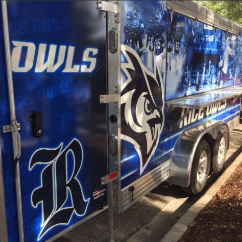
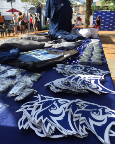
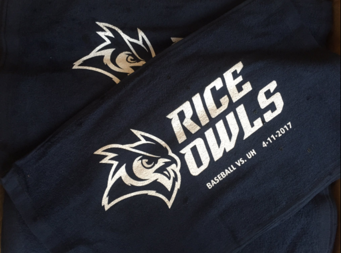
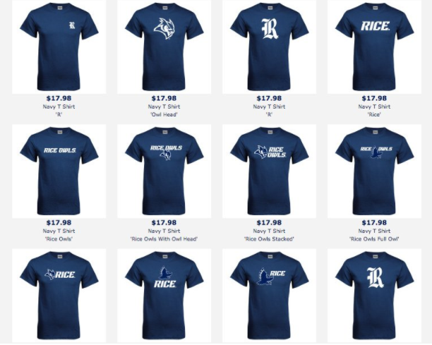
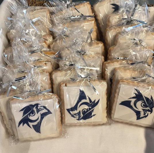
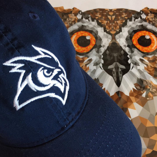
Based on this feedback, we worked closely with designers from Torch Creative and adidas to ensure our marks represented an authentic Rice Athletics brand: dynamic, sharp, aggressive and relevant. We also frequently met with our key stakeholders to get their input as the marks evolved. The result of this process is a refreshed family of design elements centered around our primary mark the Old English R, including a refreshed wordmark, owl head, owl body, fonts and a set of numerals.
PROCESS
2. Mixed feelings for the Old English Script with a sense it is disconnected from the direction of Rice Athletics.
3. Fondness towards being an owl and all that it represents but a desire for an owl mark that is dynamic, sharp, aggressive and relevant.
4. Need for marks that are legible, usable, recognizable and consistent.
Identity
As part of the overarching Rice University brand, the Athletics Department has developed an identity standard to better tell our story across a wide range of applications and media. It promotes the clear and consistent use of these standards to staff, partners and suppliers, thereby reinforcing Rice's identity in an authentic and recognizable manner. The new identity is the road map to create excitement around and develop a strong passion for Rice Athletics, while also engaging new audiences in a distinct and impactful way. The standards extend to the use of official colors, athletics marks, wordmarks, typography, lockups and other matters that affect Rice Athletics' visual identity. .



Social Media


